mockup of dermatology website on a purple background

Designing for Dual Demographics: A Dermatology Website That Speaks to All Ages

How might we design and develop a responsive dermatology website that builds trust with older patients, while also guiding younger users towards cosmetic services?

Problem

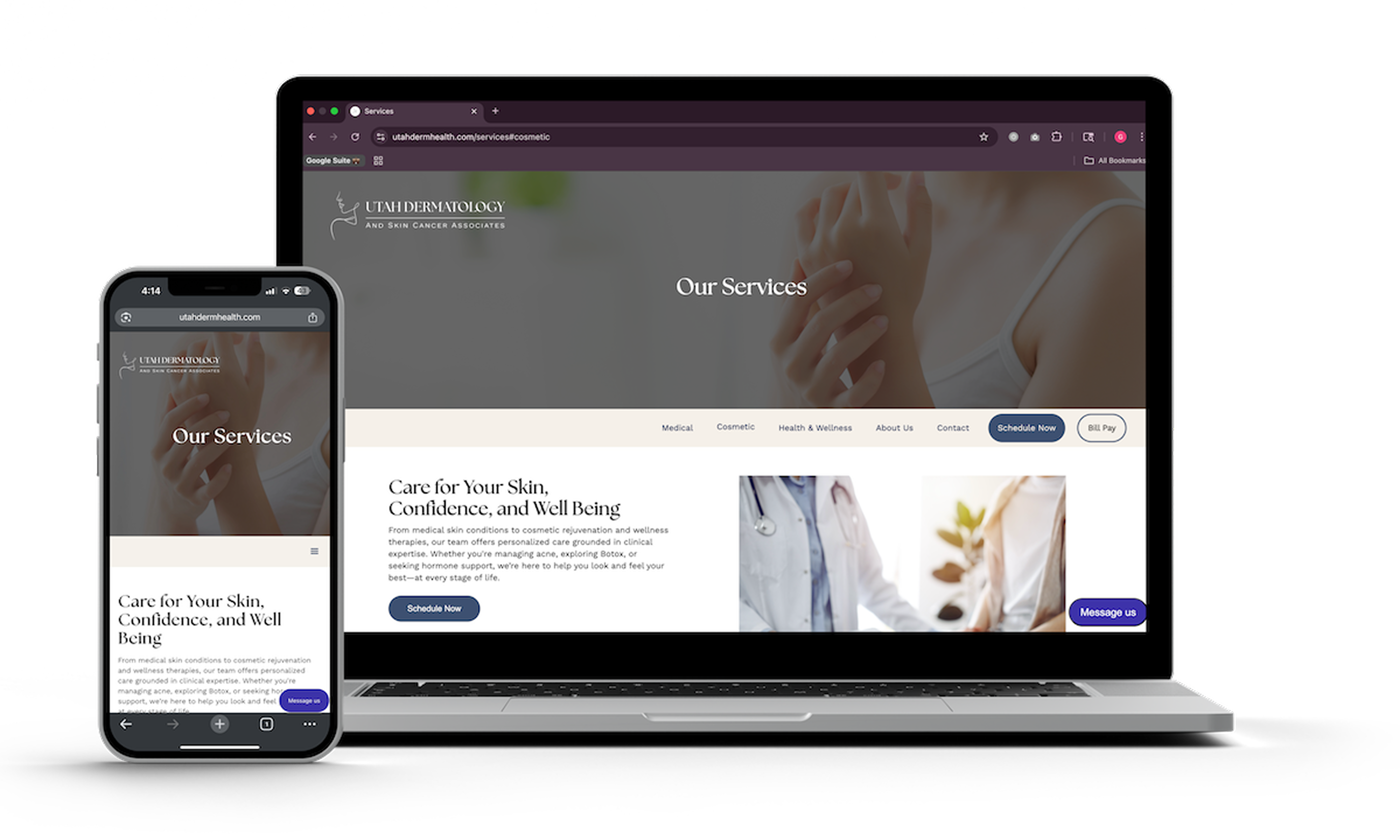
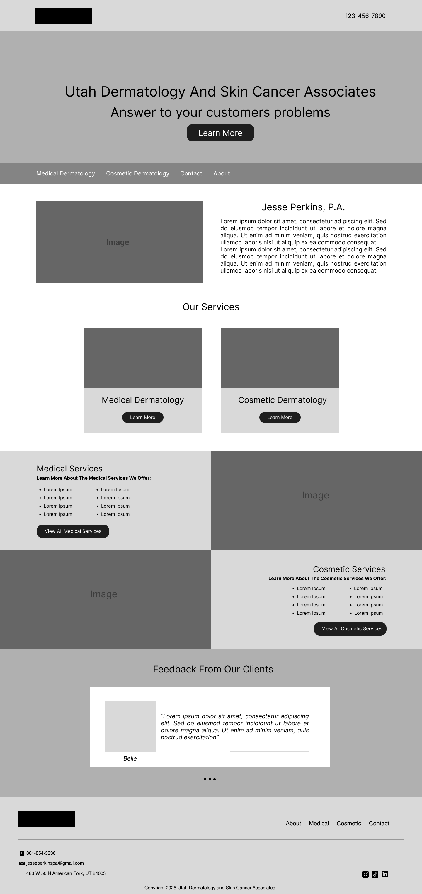
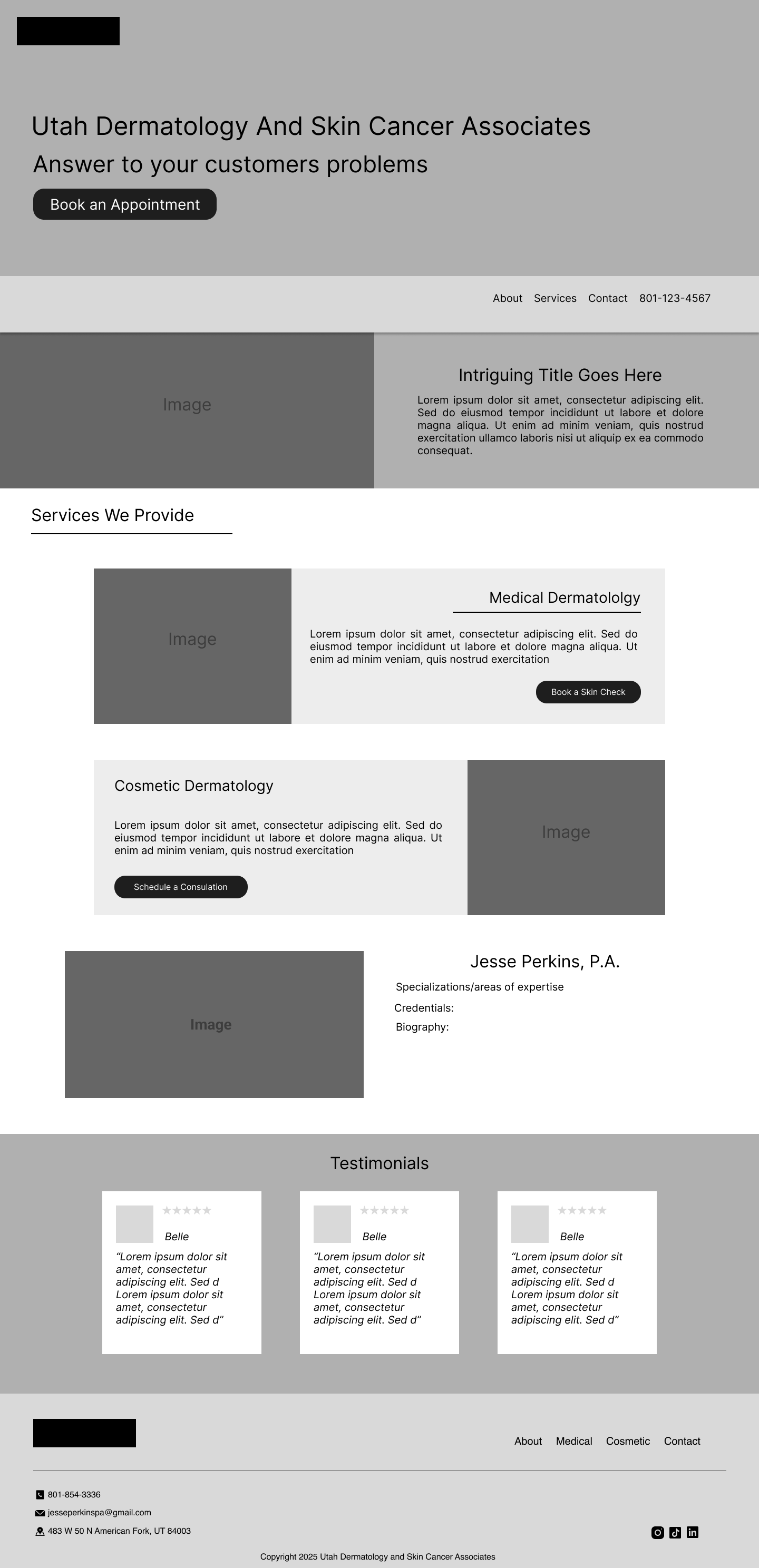
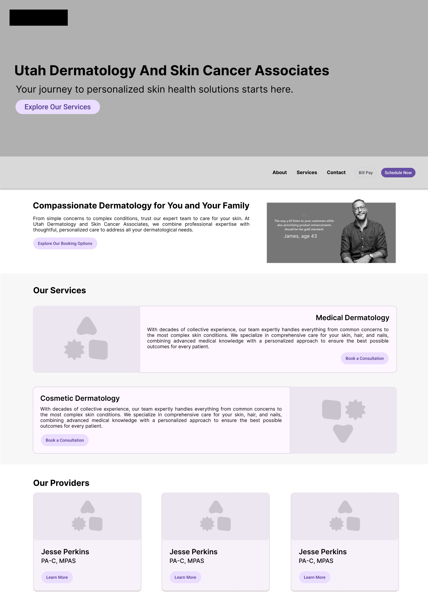
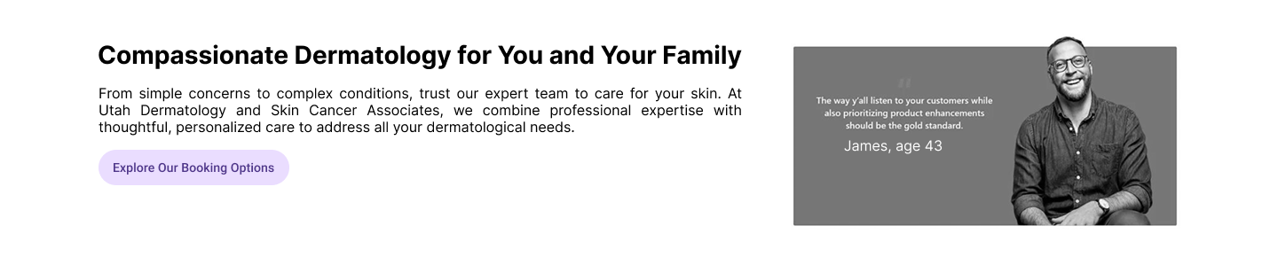
This client had no online presence and needed a professional, easy to understand website for both their older patients needing medical dermatology, and younger patients wanting cosmetic services. Both audience groups had separate goals and digital expectations that needed to be accounted for. 

Role

UX Designer, Web Developer, Project Lead

Skills Leveraged

UX Research, Wireframing, UI Design, CMS development

Duration

January 2025 - Present

Solution

Designing with clarity: To meet the needs of our users we opted for a segmented user journey for both audiences.

Cosmetic Dermatology Patients

image of young woman on her iphone

Key Needs

icon of schedule
Users want flexible scheduling options (online vs. calling)
icon of review
Users want to see real testimonials and results
navigation icon
Users expect minimal reading and intuitive navigation

Medical Dermatology Patients

image of old man on his mac

Key Needs

icon of review
Users would like to see credentials and reviews
sign-icon
Users prefers explicit navigation to discover services
computer icon
Users want to easily be able to schedule

Research Process

icon of person

Stakeholder Interview Insights

My client Jesse, wanted a design inclusive for older and younger demographics, with a simple design focused on encouraging users to schedule an appointment.
icon of analysis

Competitor Analysis Takeaways

Competitor websites segmented their services based on service type and had trust-building sections on the landing page.
icon of map

User Journey Analysis

Reviewing possible user journeys helped inform design decisions such as including testimonials on the landing page and segmenting cosmetic services based on problem-area.

Sketches and Wire frames

sketches of websitesketcheswireframe of designwireframe of design 2

Testing and User Feedback

This wireframe was tested on 2 users. Due to limited stakeholder resources, surface compositions and click-through prototypes were not created. The goal from this usability test was to see how intuitive it was for users from both audience groups to navigate their own user journeys.
Image of wireframe iteration

Audience Pain Points

image of nav bar
Navigation could be more explicit
image of trust building section
Users wanted more trust building above the fold
representation of services pain point
Difficulty reading cards, headings weren't personable

Design Updates

I reorganized the navigation to highlight “Medical” and “Cosmetic” pathways more clearly, and prioritized the scheduling button to streamline user flow. Added a trust-building section right under the hero to reinforce credibility and encourage deeper engagement. Button language and section headers were refined to feel more intuitive and welcoming, and I left-aligned the service cards for better readability across audiences.
Image of wireframe iteration

Changes Implemented

improved nav bar
Updated navigation to state 'Medical' and 'Cosmetic' instead of 'Services'
improved trust UI
Added a trust-building section and clarified CTA's
representation of services fixed
Improved readability of cards and updated headings

Reflection

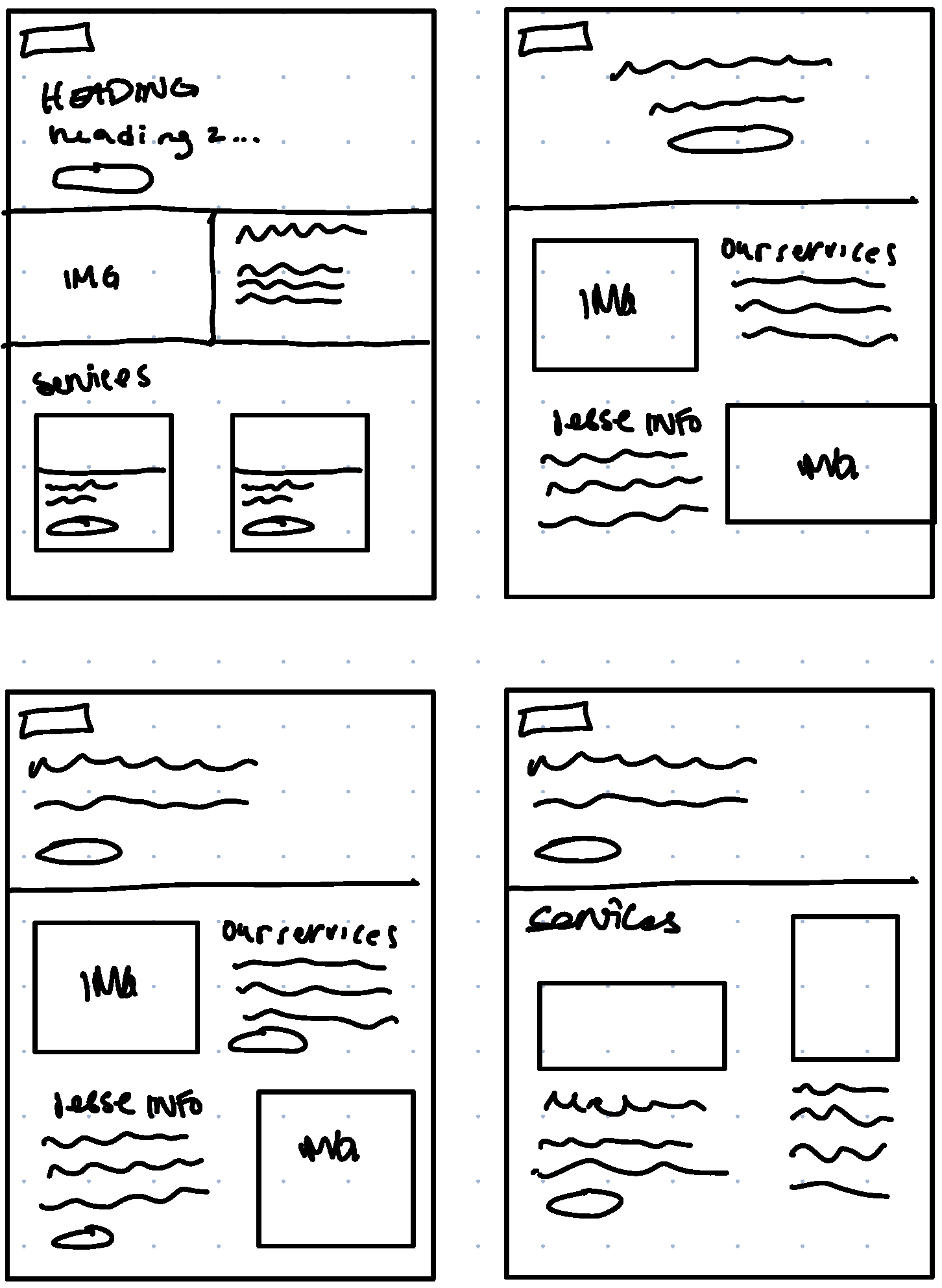
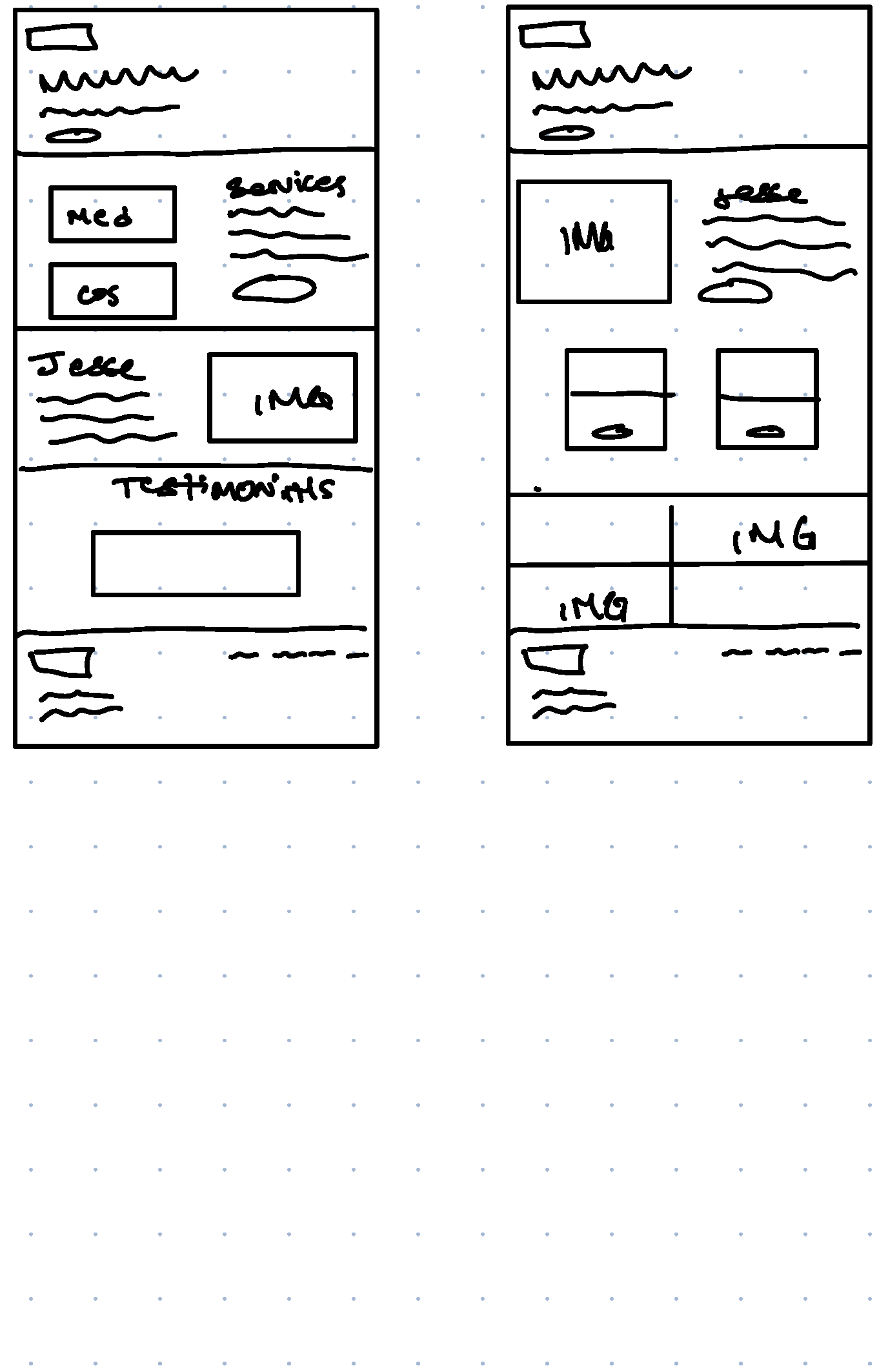
When designing this website I was in the middle of my transition from development into design, and discovered the importance of UX research early in the discovery process. My initial sketches and wireframes didn't reflect what the actual problem was my users were experiencing, so unfortunately I was designing for the wrong problem. It wasn't until I began performing my usability tests that I realized I needed to redefine my problem based on my users feedback, not on my assumptions. This project is still under development, and many changes are still underway.  

Designing with accessibility in mind, because great experiences should be usable by everyone.