Improving the Camera Live-View in Blink: A 7-Day UX Sprint
How might we increase user satisfaction when interacting with the live view functionality?
Problem
Individuals using the blink app are having a less than ideal user experience attempting to view live stream functionality within the app.
Skills Leveraged
UX Research & Analysis, Interaction Design, Testing & Iteration, Accessibility
Duration
7 Days | August 28th - September 4th
Overview
As part of preparing for a UX design conversation with an industry professional, I challenged myself to complete a 7-day design sprint that demonstrated my end-to-end UX process. I redesigned Blink's Live View functionality after identifying friction points in my own experience using the app. My goal was to make Live View more accessible, informative, and intuitive through rapid user research, high-fidelity prototyping, and usability testing. I plan to continue expanding the project to validate and refine the proposed solutions with additional users.
Phase 1: Discovery Process
Examination of product reviews
Blinks users had two main pain points:
1. UI frustration: The Blink interface was not as informative/easy to use as its competitors.
2. Frustration with the live view experience: long loading times, short viewing times and lack of control over UI.
User Journey Analysis
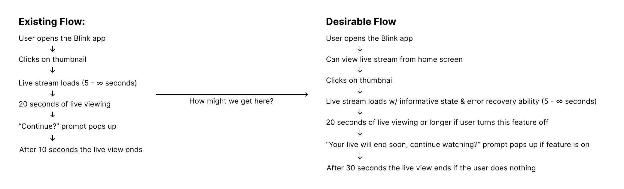
I took the two most common complaints and mapped out the user flow of that experience.
Putting myself in the users shoes & heuristic evaluation
I completed the user flow myself and conducted a heuristic evaluation, rating which friction or pain points were a cosmetic vs usability problem and how severe they were to my experience. I then outlined issues and recommendations.
Usability Testing
I conducted usability testing with 2 individuals, one who already uses the Blink app, and another whose never used it before, but has used other security camera apps. I shadowed them as they explored the app and documented their friction points, opportunities for improvement and any comments they made about their experience using the current flow.
Phase 2: Defining & outlining
Business Constraints
Blink may have a reason (perhaps technical or financial) that is limiting the app from offering a live view streaming functionality immediately.
Audience Assumptions
- The user would like to view a live stream of their feed
- The user cares about monitoring the environment their camera is set up in
- This is not the users first time interacting with a security camera app (whether that be Blink or another competitor)
Project Constraints
- I had 7 days to complete this project
- Limited ability to view user flows of competitors & replicate pain points
Defining the Problem
- Who was having this experience?
- What was happening?
- When was it happening?
- Where was it happening?
- Why was it happening?
After considering all of my constraints, assumptions and problem defining questions, I refined my problem statement and structured my "How might we?" question to help inform phase 3.
Phase 3: Evaluation & Ideation
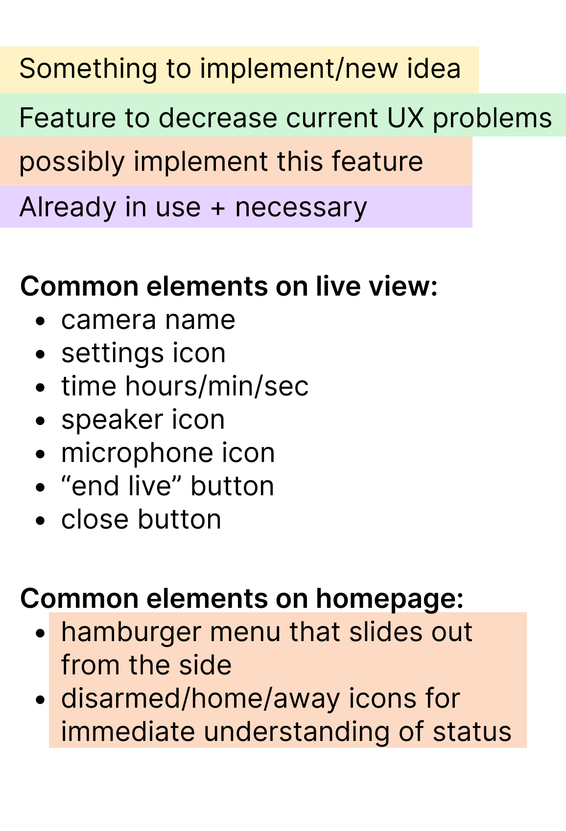
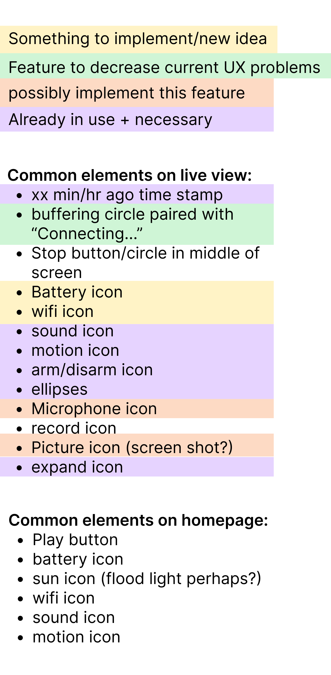
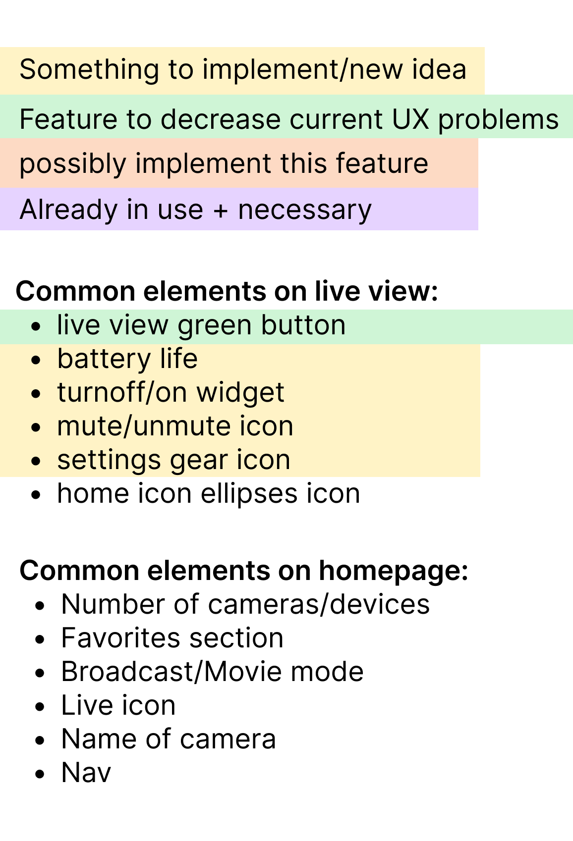
Competitor Analysis
I decided to complete my competitor analysis in this stage instead of during the discovery process because with my limited time frame, I wanted to know exactly what problem I was trying to solve before evaluating competitor apps and user flows. I examined 4 competitors and documented their commonalities, strengths, and weaknesses. Without access to live camera feeds within their app, I opted to watch instructional videos on users interacting with the app to try and understand their flow.
User Journey Map Past & Future
Phase 4: HI-Fidelity Surface Compositions, Usability Testing & Refinement
Context
Since I was on a limited time frame, and only had about a day to complete my designs, usability tests and updates, I opted to go straight into hi-fidelity surface compositions. My surface compositions were not clickable prototypes, so my usability tests consisted of sharing my design link through Figma and having the user talk out loud as they explored the design. I asked them to tell me what made sense to them, what was confusing etc.
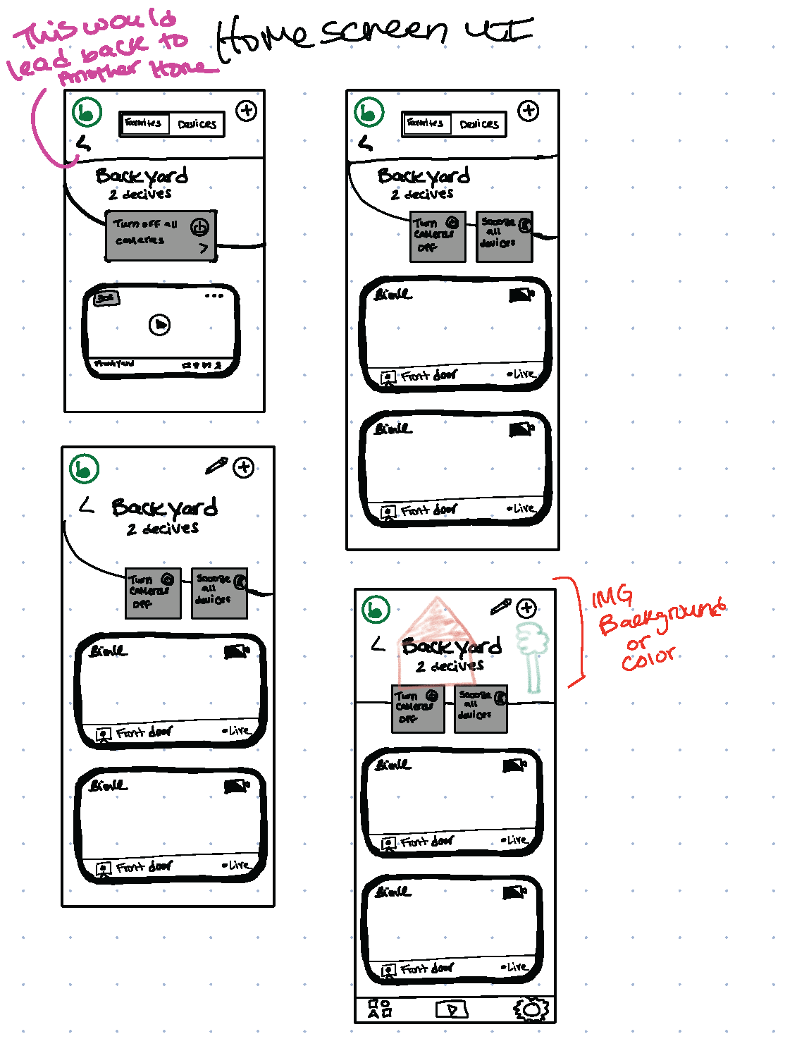
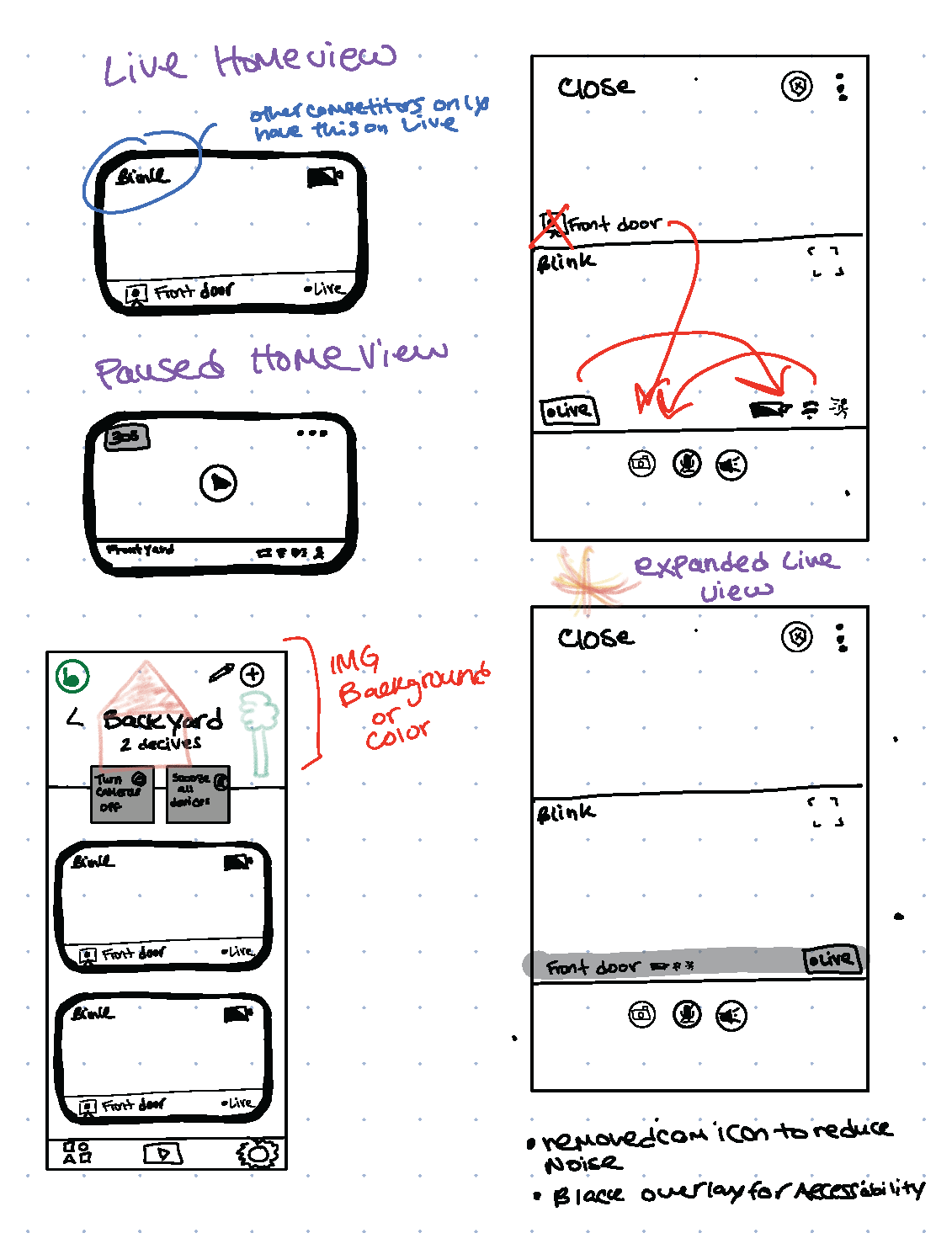
Version 1
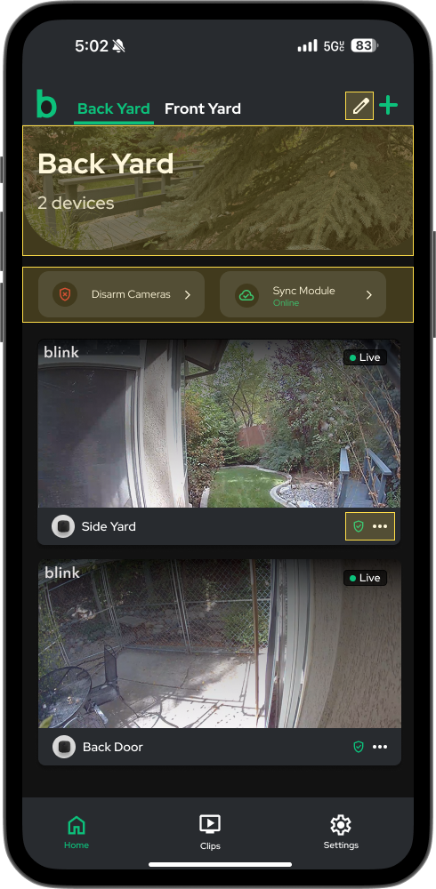
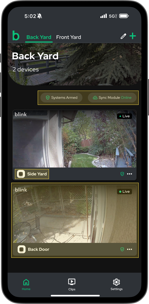
Home page updates:
- Added hero image customizability
- Detailed number of devices
- Added cards to update status of devices
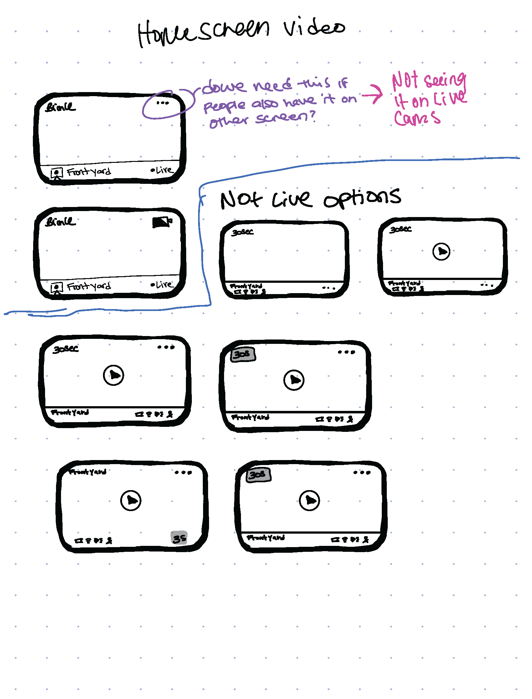
- Changed the UI on homescreen viewing cards
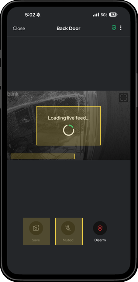
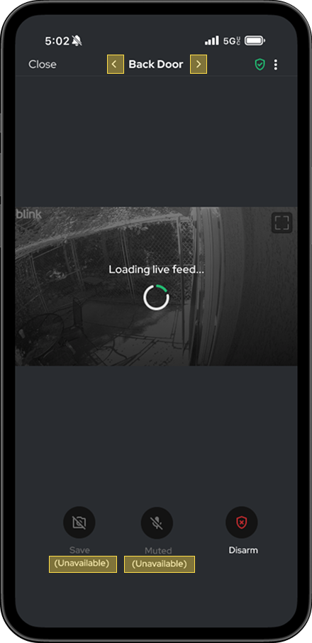
Loading view updates:
- Added arm/disarm status
- Updated spinner to a progressive loading state
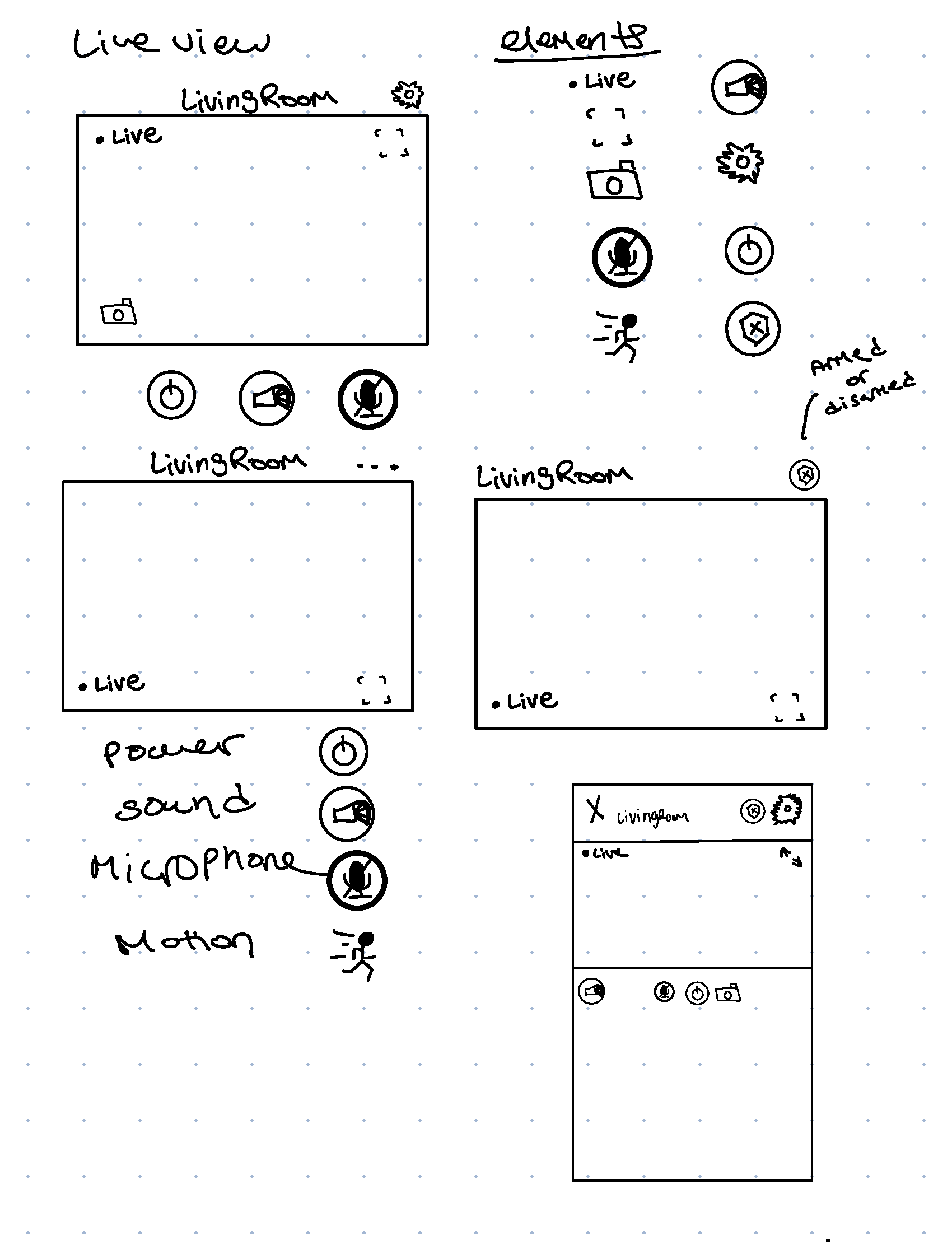
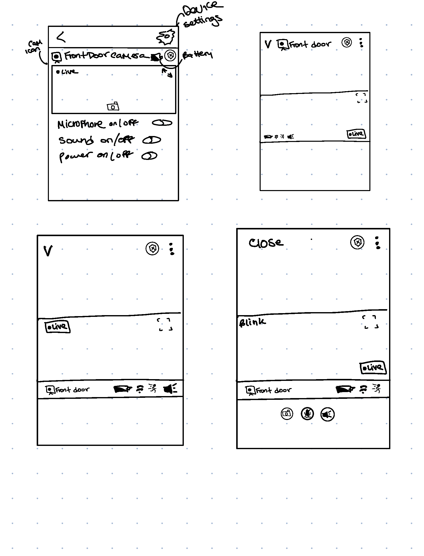
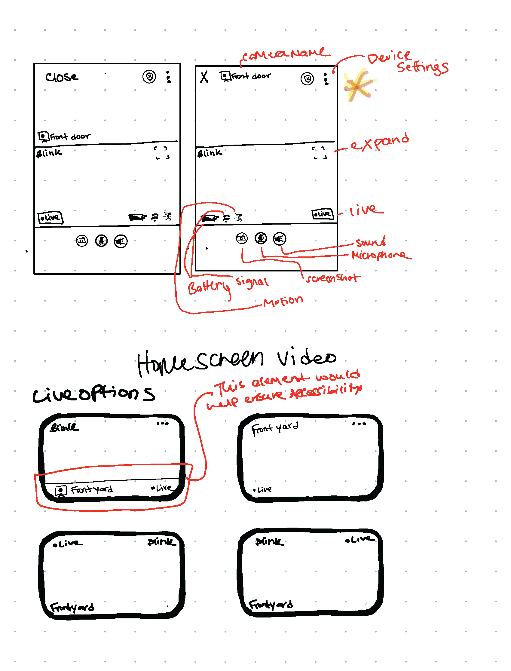
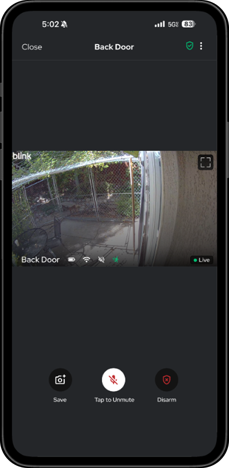
- Added informative elements to live view screen
- Updated icons to include color
Version 2
Home page updates:
- Added pencil to edit picture/name of scene
- Made arm/disarm and sync module smaller
- Added arm/disarm status to card and ellipses for quick edits, removed battery
Loading view updates:
- Changed loading state to be more informative
- Removed & disabled inactive elements until feed loads
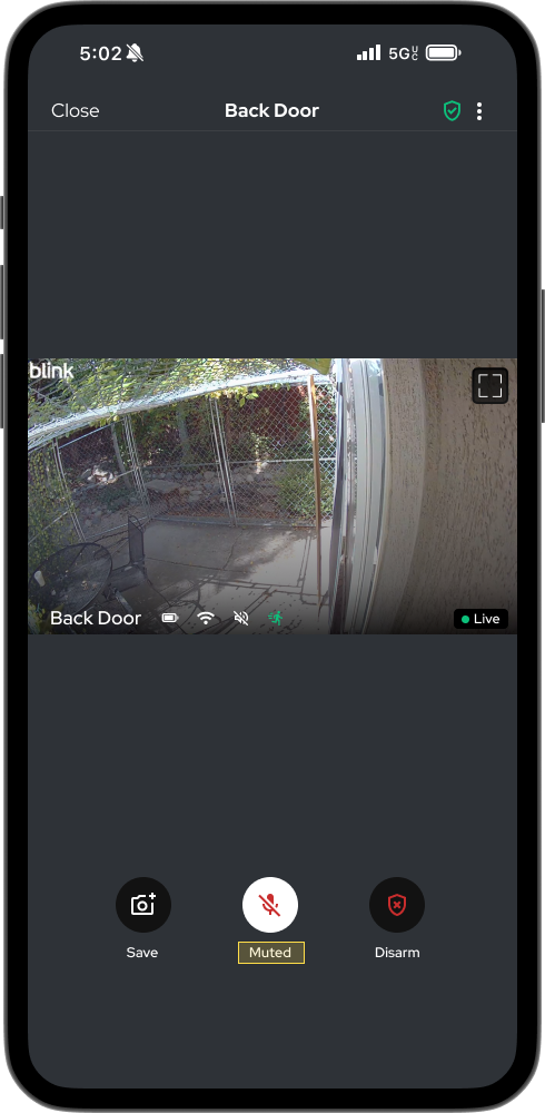
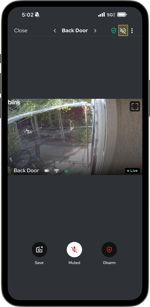
Live view updates:
- Changed mute language to be informative instead of instructive
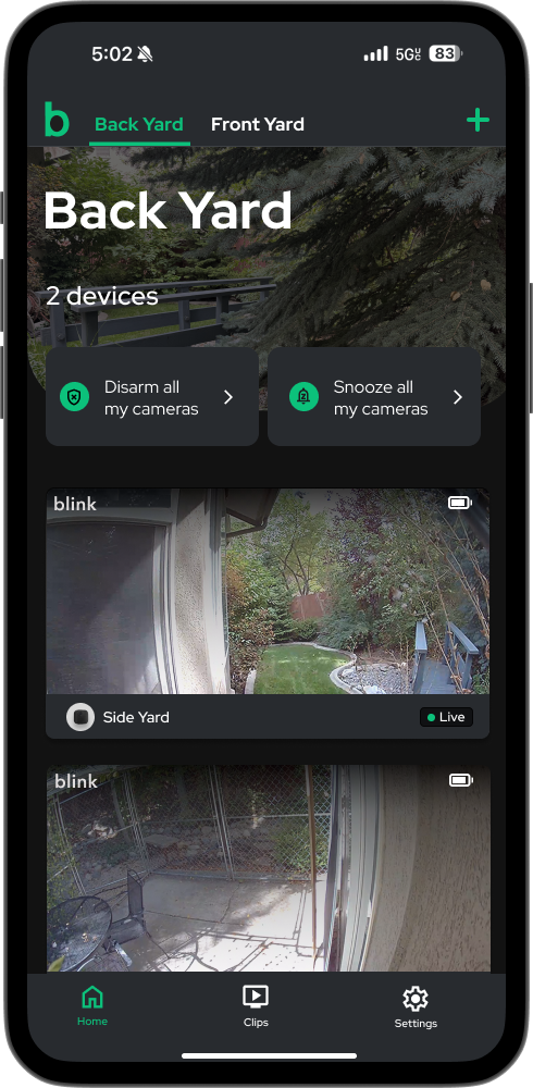
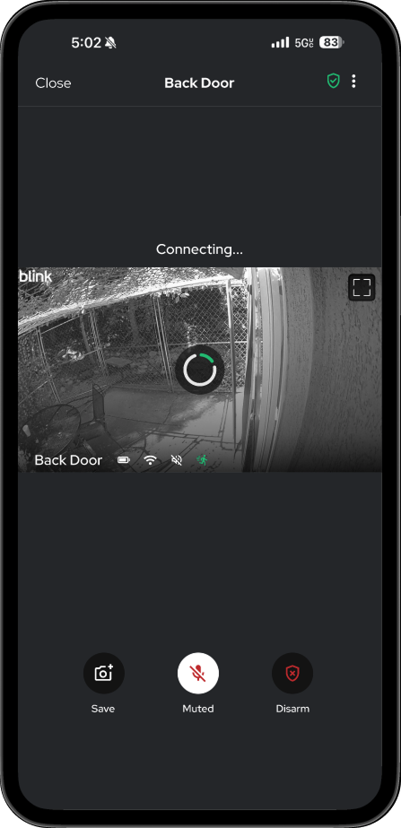
Version 3 (Final)
Home page updates:
- Made clickable cards into informative chips
- Updated design of camera icon to be aligned with design system
- Updated camera name to bold for better readability
- Changed card color, and elevation to make more accessible for individuals with low vision
Loading view updates:
- Add pagination for easy access to other cameras
- Added informative states to unavailable elements for accessibility
Live view updates:
- Brought back volume control button
Reflection
What I learned
I didn’t expect a seven-day sprint to be this much fun. It reminded me how much I love learning about human behavior. My favorite parts of this project were when my assumptions were wrong, specifically when a feature I thought didn’t matter, actually mattered a whole lot! Or when people viewed and used the content completely differently than I do. I learned more about designing for disabled states while keeping accessibility in mind.
What I would have done differently
If I could have done this project differently, I would have spent less time on studying the overall app. Not pictured in this case study are all the other flows, screens, and pain points I studied extensively. I realize now I should have taken the time to slow down and evaluate the MVP, and then proceed with the exact flow I wanted to work on. In addition to that I think it would've been so fun (and helpful) to talk with more people and see what they think to better help inform my design decisions.
What I would have done if I had more time
- Create prototypes with animation and test my designs on a wider group of users to get a more well rounded understanding of the usability of my designs.
- Accessibility audit & testing to ensure compliance.
- I would design and build prototypes for the other micro user-experiences that contributed to the overall poor user experience of the live view functionality.
- I would study other competitors in depth, specifically their user reviews to try and gauge whats working for them and an opportunity for Blink.
Designing with accessibility in mind, because great experiences should be usable by everyone.
.png)